HOW DO YOU SHOP?
CHALLENGE:
User research suggested they wanted more product information, contextual imagery, and to be able to research and purchase the product on the same page.
In order to better serve the users’ needs, we broke down our site architecture and defined these main goals:
-
Clean up the architecture of the purchase funnel
-
Create intermediate category pages to show users the scope of the catalogue
-
Devise and implement a new strategy for the product details pages
The last point is detailed here
MY ROLE
I was lead designer and responsible for much of the research going into this project. I pitched the concept to upper management and orchestrated design handoff to the development team.
HYPOTHESIS
By breaking up the Landing Page content and spreading it across pages that are in the purchase funnel, TaylorMade will better serve the needs of the personas and increase conversion rates.
SOLUTION
Previously, TaylorMade’s online marketing strategy involved bespoke Landing Pages which mirrored their print and TV advertising. There were several pain points:
-
The creation of these pages involved heavy development and design resources
-
Their traffic count sharply dropped off once the products were released at retail.

GA analysis of conversion relationships between Product List Pages vs. Marketing Pages
I ran analyses of the performance of the Landing Pages against the performance of the Product Listing Pages over the lifecycle of the best selling products and found the Product Listing Pages had a higher value and were related to higher conversion rates.


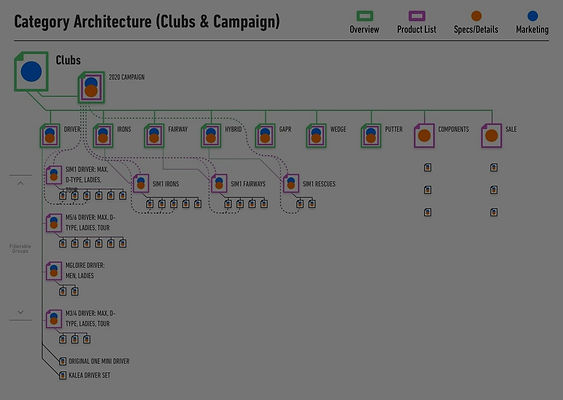
Analysis of eCom Funnel Architecture and proposed realignment

Breakdown of architecture within the Clubs category of TaylorMade's catalogue
In order to leverage new content in the eCommerce funnel and increase the efficacy of the content, I defined the locations most-related to the purchase funnel:
-
Global Navigation
-
Campaign Overview Page
-
Product Listing Page
-
Product Details Page.
GLOBAL NAV
The design and optimization teams had been tracking the performance of TaylorMade’s global navigation after a major redesign and had noticed some performance issues. Analysis showed that the majority of links in the header dropdowns were not being used, with some items getting one click per month.
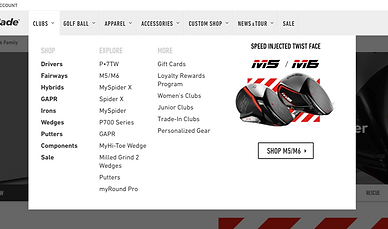
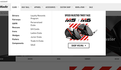
Simpler navigation with a more direct overview
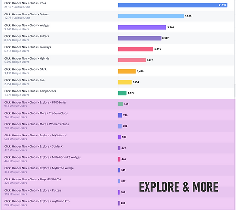
A steep drop-off in interaction in the second column of links
Because this architecture change had removed the one-off marketing pages from the site, I was able to reduce the amount of links. This removed visual noise and presented a clearer vision of TaylorMade’s product catalogue.
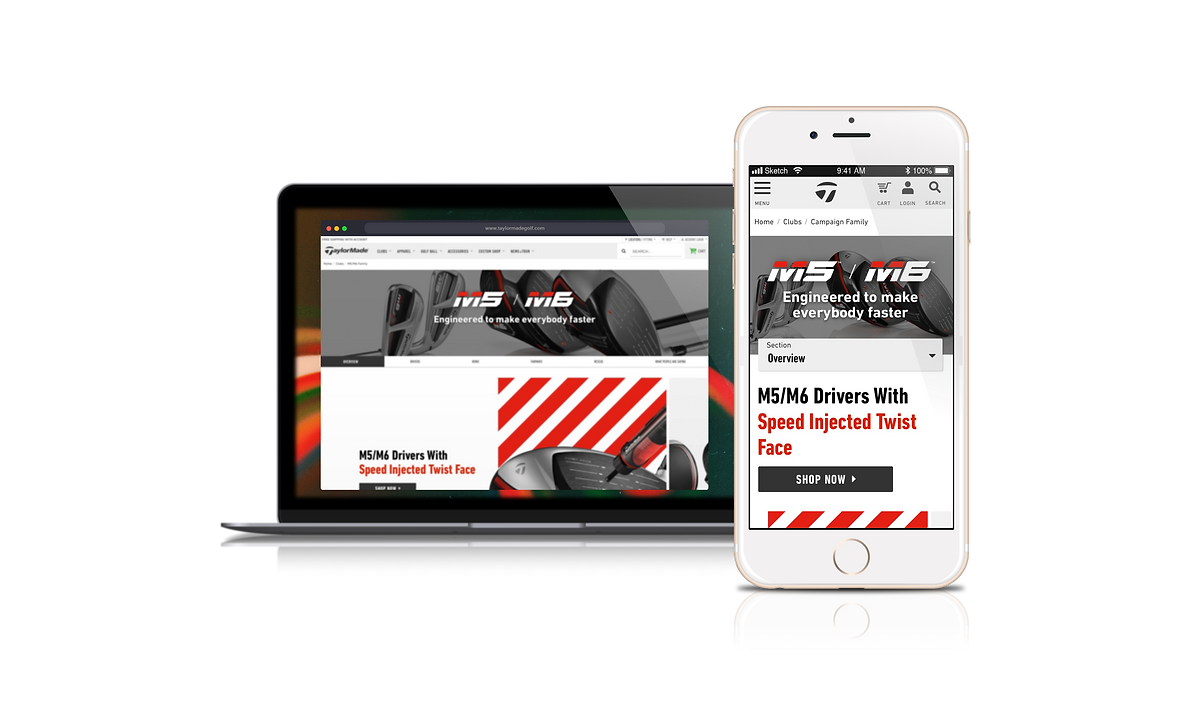
Campaign Overview Page
This page supports TaylorMade’s marketing strategy and gives users an overview of the product campaign and a scope of what product lies within it.
-
Full overview of associated product
-
Marketing slogans
-
Artistic campaign images

The first content block is used for campaign beauties or video content. This is mostly a marketing play, establishing the brand message of the specific campaign.

The second content block showcases the products in the sub-type, drivers in this example. This horizontal-scrolling module has a strong information scent with visual redundancies for discoverability.
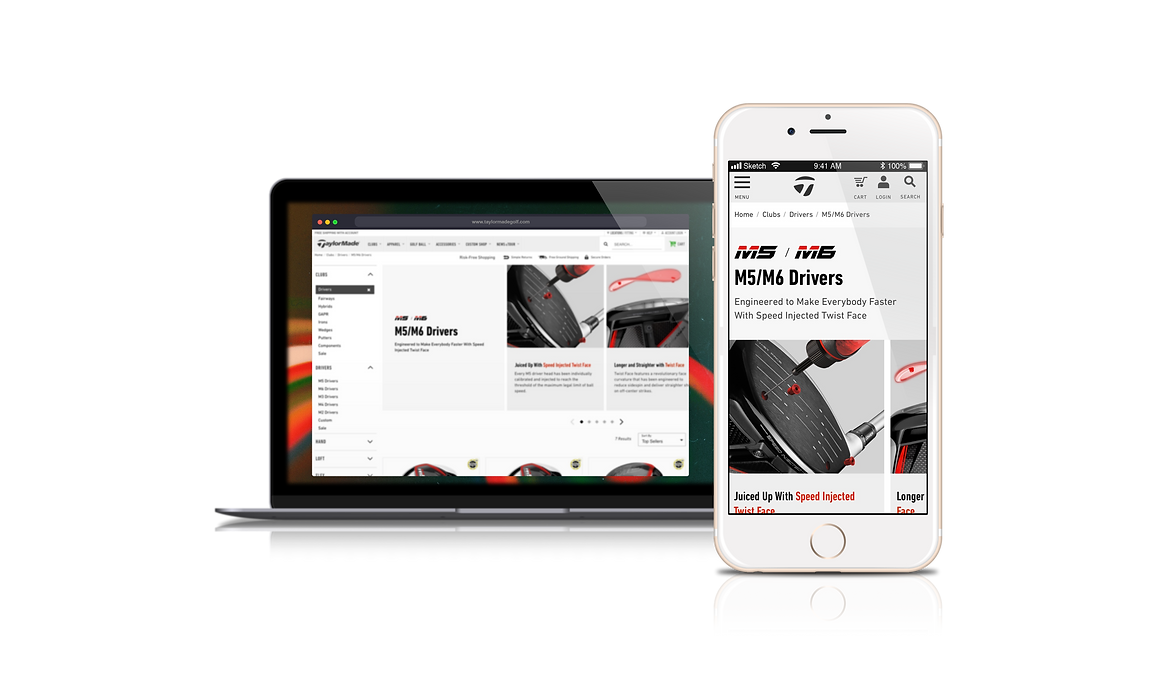
Product Listing Page
These pages were better-connected to the purchase of product than the landing pages themselves, with more users arriving on these pages than the Landing Page. I included:
-
Features and benefits of club family type
-
Expandable list of technologies featured across the clubs


In many metrics, the product list page out-performed the marketing landing page
I took insight from the inverted pyramid principle to leverage content only applicable to each stage of the funnel. For example, detailed product specs do not need to be on a Listing Page, but content applying to the category is perfect here.

The first content block is a set of applicable features and benefits of the clubs on the page. This gives the user an overview of the product advantages before diving into product page.

The second content block is a truncated list of associated technologies. This addition represents user feedback to include more product information, as well as a value ad for products that can cost several hundred dollars.
Product Details Page
The product page was lacking content desired by the personas relevant to TaylorMade's eCom site. It had some key images of the product, a spec sheet, reviews, and a short write-up of the product, but users were asking for more robust product details, contextual imagery, lifestyle photos of golf being played, golf tips, and product comparison.